Projects
We proudly work with some of Australia's leading interior designers sharing expert advice, tile information and related services. Contact Surface Studio today about your next project.
The Japanese cherry blossom is the inspiration for this chic Sydney Ramen bar.
By Felicity Marshall Sydney Morning Herald Domain 5 October 2018
Architect: Sarah Lee
Interior Designer: Elton Chen
Image Credit: Andrew Worssam & Jayden Huang
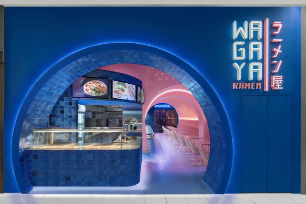
The fabled Japanese cherry blossom season forms the inspiration for the petite but chic Wagaya Ramen bar in a suburban Sydney shopping centre.
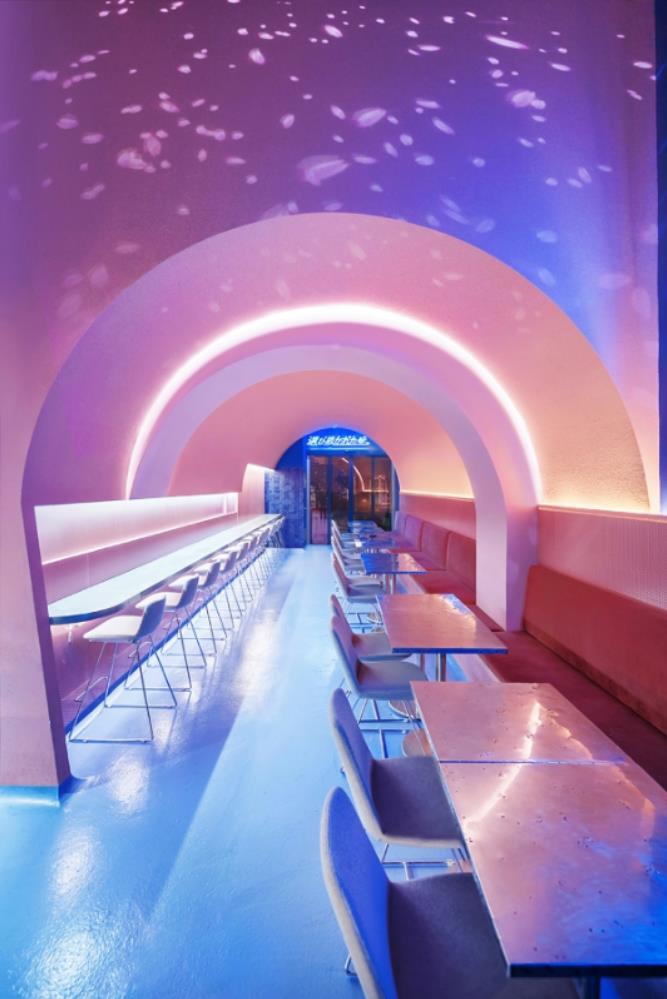
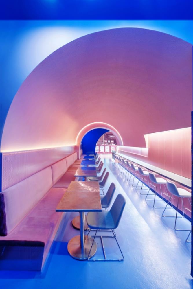
The arched entrance and ceiling are an architectural rendition of the experience of walking down a sakura tunnel – a long, straight pathway with a colonnade of cherry trees planted along either side.
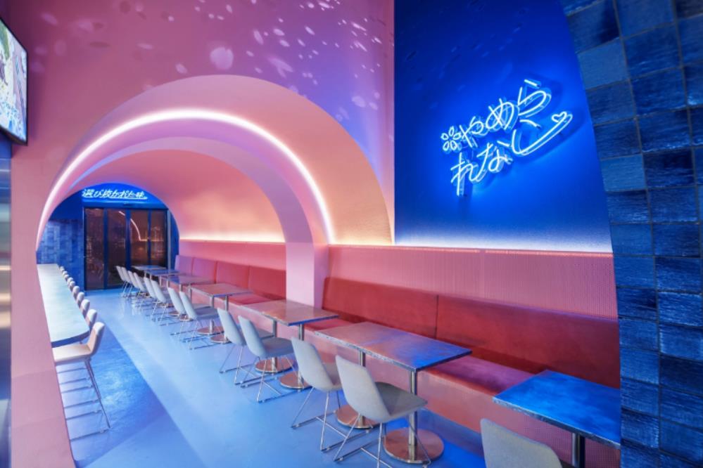
The soft blush-coloured ceiling and upper walls of the space replicate the ethereal effect of sunshine filtered through thousands of delicate pink cherry blossoms.
Cleverly concealed lighting is used to project irregular blotches onto the ceiling, recreating the dappled pattern of sun rays penetrating a canopy of branches.
The project, which won the prize for best commercial interior public and hospitality at this year’s Dulux Colour Awards, has a sense of craftsmanship and thoughtfulness that belie the site’s relatively modest size of 70 square metres and location at the Lidcombe shopping centre in western Sydney.
Span Design’s Elton Chen, who is the interior designer responsible for the project, says he was inspired by the aesthetic influences soaked up on his regular trips to Japan.
“I go to Japan almost every year,” he says. “I like the culture and food in Japan. During my travels, I had a lot of inspiration for this space.
“I went to Japan in the cherry blossom season – they call it hanami season. The feeling is really awesome. Pretty much the inspiration for the shop was drawn from this.”
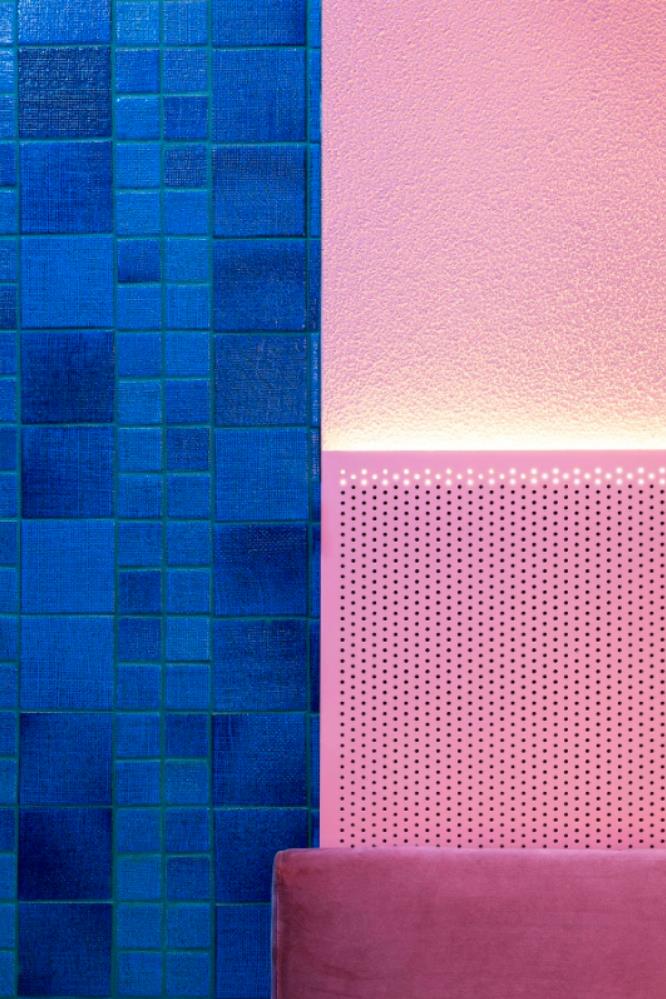
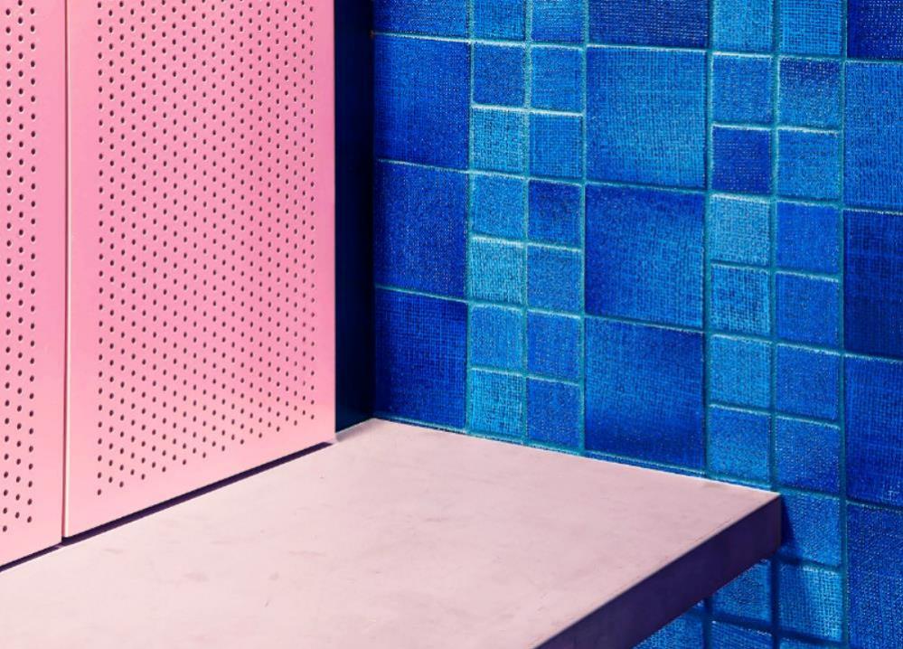
The ramen bar, part of the Wagaya chain, features a contrasting blue shade on the lower section of the walls, a tribute to the rich, deep-blue characteristic of Japanese traditions such as aizome, or indigo dying.
The use of the two shades also helps to zone the curved service counter from the dining area.
“We really wanted to create a contrast to the pink,” Chen says. “The pink is really warm and red.
“At the entry to the shop, we wanted to create something a little bit cold and calm.”
Neon strip-lighting embedded in the ceiling arch and wall panels create illumination with a subtle, sophisticated mood.
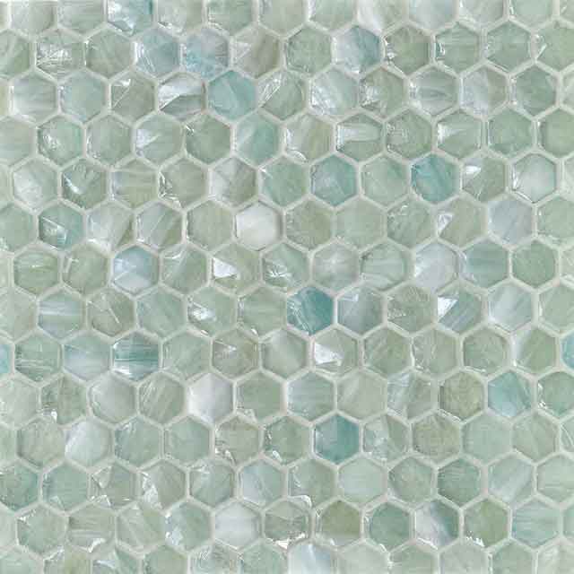
Despite working to a tight deadline – short timeframes are a characteristic challenge in projects of this kind – Chen sourced artisan-made Japanese tiles for the entrance and curved service counter.
The interior also features custom-made, blush-coloured velvet banquette seating and a light-blue flooring made from thermoset resin.

